TL;DR: Most location decisions never get analysed, because the setup — sourcing data, checking licences, reprojecting, styling — costs more than the answer is worth. ShowMeOnMap collapses that setup to a sentence: you ask in plain language, and a finished map comes back with the data fetched live and the source cited on the layer.
Most location questions never get properly analysed. Not because they are hard questions, and not because the methods are exotic — the methods have been in textbooks for decades. They go unanalysed because the setup costs more than the answer is worth.
To find out whether a second location would eat into your first one, someone has to source the boundaries, find current population data, check the licence on it, get it all into the same projection, run the model, and then style the output so a non-specialist can read it. That is a week of specialist time. So the question gets answered with a hunch instead, and the hunch is usually about the place the decision-maker happens to know best.
ShowMeOnMap exists to make that first step cheap. You describe what you want to know in plain language. What comes back is a finished map — the data fetched live, the analysis run, the styling already handled.
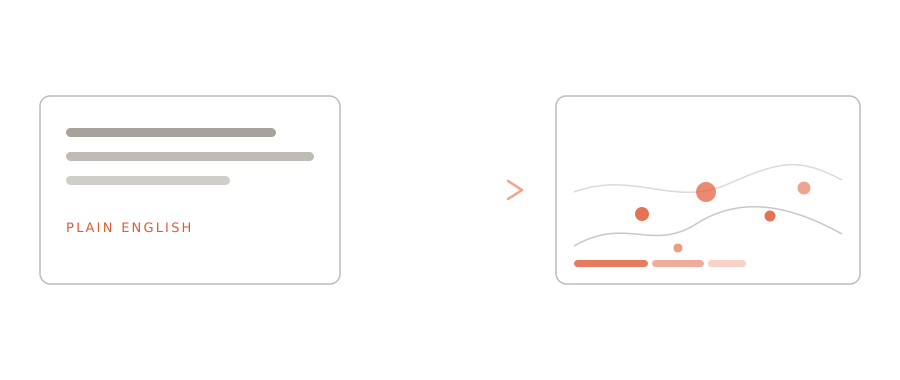
What people actually ask
The questions that come up most are rarely exotic. They are the ordinary ones that were simply too expensive to ask.
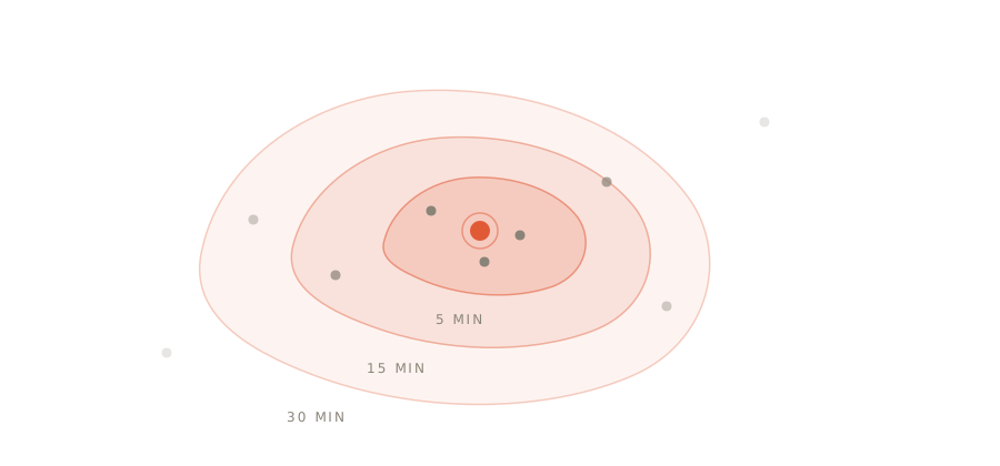
Who can actually reach this place? Not distance in a straight line — real travel time. The area someone can reach in fifteen minutes is a strange, lopsided shape that follows roads, bridges and rivers, and it rarely looks like the circle people picture. Retail siting, clinic access, depot placement, service-area promises: all of them turn on that shape.
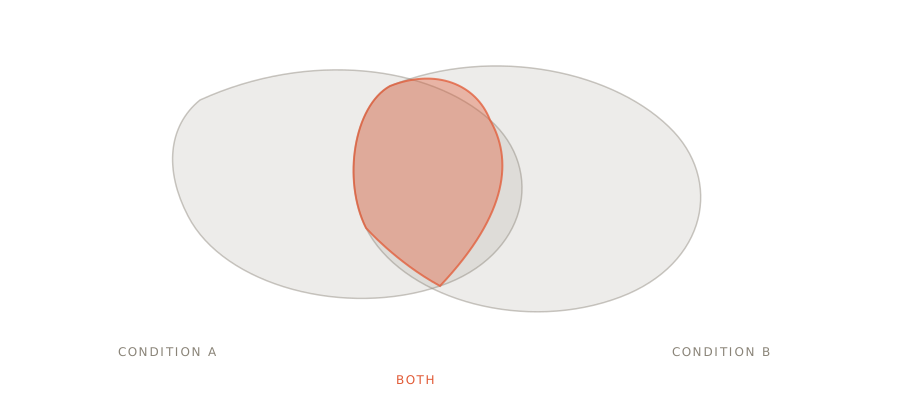
Where do these two things coincide? Almost every siting decision is really a question about overlap — somewhere with enough people, and the right zoning, and not already served by a competitor. Each condition is easy alone. The value is in the intersection, and in seeing how small it usually is.
Where is this unusually concentrated? Incidents, demand, outages, complaints. Plotting the points tells you where the people are. Finding the genuine concentrations — the ones that stand out from the underlying population — is a different question, and the useful one.
Which of these candidates is strongest, and why? When there are eleven possible sites and four factors that matter, the honest answer is a ranking you can interrogate, not a single winner handed down without reasoning.
Why it matters that the answer arrives finished
There is a difference between a tool that can produce an answer and one that produces an answer you can act on.
A map that needs another hour of styling before anyone else can read it is not finished. Neither is one that leaves you unsure whether an empty area means nothing is there or we had no data for that area — those are completely different findings, and confusing them is how analyses mislead people.
So: every value on a ShowMeOnMap map comes from a live upstream source, fetched when you ask, and the map tells you which one. Where a source has nothing to say about the area you asked about, the map says so rather than filling the silence. That constraint costs us features. It is also the only reason the output is worth putting in front of someone who will make a decision with it.
The change is in the asking
The shift is not that these analyses became possible. They were always possible, for organisations that could staff them.
The shift is that the cost of asking dropped far enough that you can ask badly, look at the result, and ask again. That is when spatial analysis stops being a project someone commissions and becomes something you do while thinking — three questions before lunch, most of them dead ends, one of them the thing you needed to know.
Common questions
Do I need an account to try it? No — three maps a day work without one. Analyses that use the multi-step agent (site ranking, catchment models) need an account and credits.
Where does the data come from? Live public sources — USGS, BC Wildfire Service, World Bank, Eurostat, OpenStreetMap and about forty more — each fetched at query time and cited on the layer. The full list, with licences, is at /data-sources.
Can I put the result in a report or an article? Yes. Maps export as images and CSV/GeoJSON, and every map has an embed code that keeps the citation in the caption. Live examples: the BC wildfire tracker and the earthquake tracker.
What happens when there is no data for my area? The map says so. "The source reports zero here" and "the source does not cover here" are rendered as different statements — that distinction is the product.
Have a location question you have been carrying around unanswered? Ask it.